How to teach technical concepts with cartoons
People sometimes tell me these days “wow julia, you are so good at drawing, it is so cool!”
I think this is kind of funny because, this is what happens when I try to draw animals.
But! There actually is a skill to explaining technical concepts to people with drawings. And I think I’ve become pretty good at that skill! It is just a different skill than like “drawing an elephant that looks like an elephant”
This post is about a few patterns I use when illustrating ideas about computers. If you are interested in using drawings to teach people about your very favorite computer topics, hopefully this will help you!
Let’s talk about how to structure cartoons and how to translate computer concepts into pictures!
cartooning isn’t about drawing skills
Just to emphasize it again – this is basically the entire visual vocabulary I use.
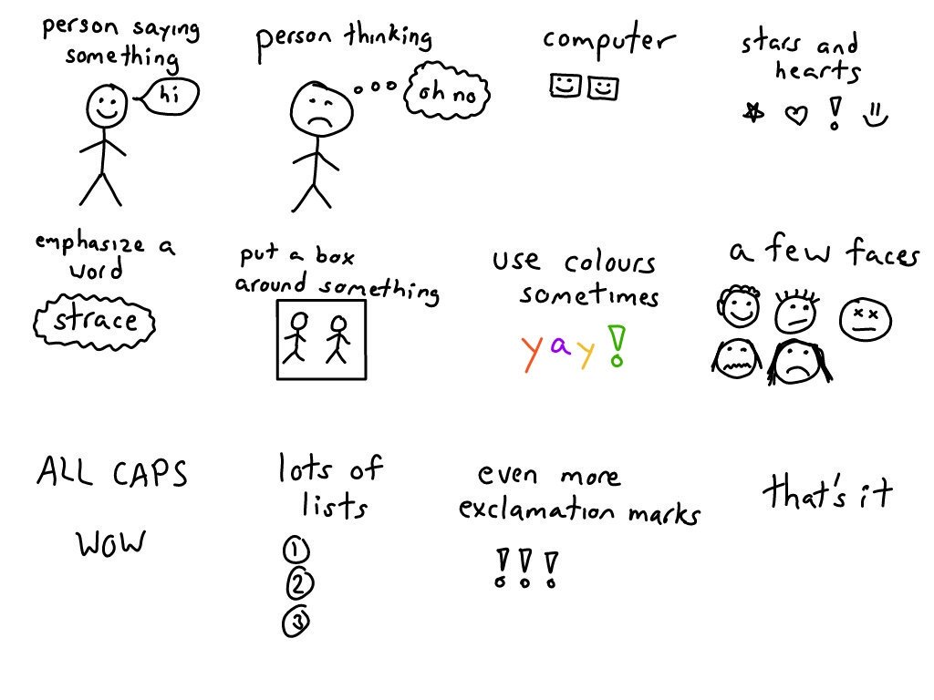
I think of tech cartooning as being about cartooning skills! I need to be good at:
- using a very small number of words to express an idea (for example this mutexes cartoon has maybe 60 words in it)
- breaking something down into simple concepts (“what are the key ideas you need to understand DNS?”)
- staging relevant scenarios (“what’s a good example to use to show how a mutex works?”)
Here are some tactics I like to use when drawing!
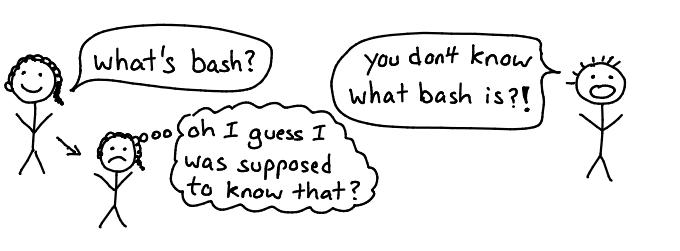
personify the characters
I do a lot of personification/anthropomorphization – I’ll take a system and turn it into a cast of characters who talk to each other. For example, here’s a scene from Kubernetes: the kubelet component is talking to the API server

This is useful because
- it emphasizes that the “kubelet” and the “api server” (whatever those are) are important concepts in Kubernetes
- it shows you that those two components communicate with each other
- it’s more fun than reading a paragraph saying the same thing
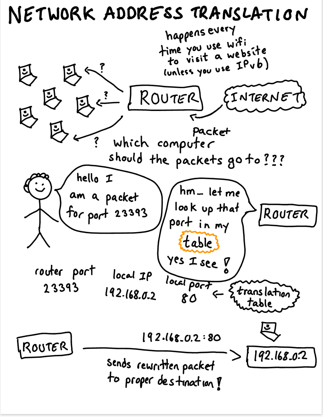
Here’s part of the cast of characters from my networking zine: (a laptop! a router! an operating system! a program!)

Taking a complicated computer system and breaking down “ok, these are 3 main important characters in this system” is incredibly useful.
show a scene
The next step after just making your characters is to put them into scenes and make them interact with each other! So once you’ve established “the important characters here are the laptop, the DNS server, and the HTTP server”, you can show how they actually work together in real life.
Here’s a scene with two humans talking:
and one with two programs who are both using the same mutex:

I think this scene (with program 2 thinking “not my turn yet”) is a pretty clear way to explain what happens when a mutex is in use, and I think it’s faster to understand what’s going on than if you read a paragraph explaining the same thing.
make a list
I make a LOT of lists (for example, this post itself is a “list of things I’ve learned about making comics :)”). A few examples:
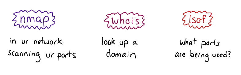
Here’s part of a list of networking tools and what they’re for
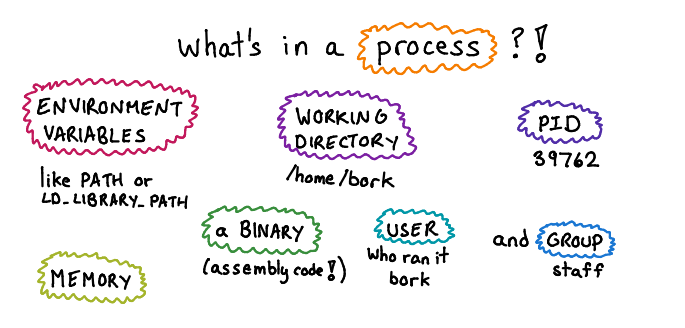
a list of attributes of a Unix process
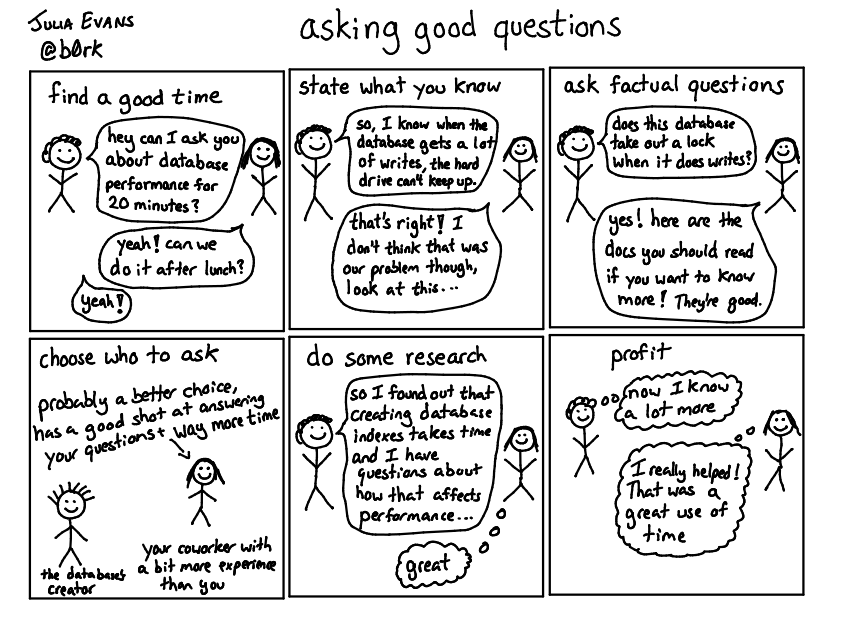
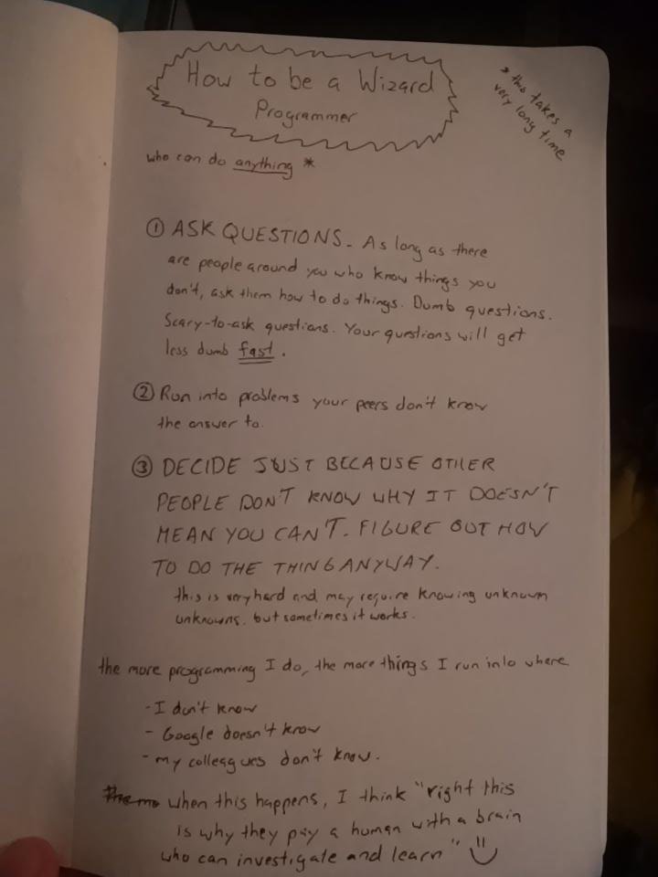
and a list of strategies for asking good questions
A few things I love about making lists:
- you can make a list of steps (step 1! step 2! step 3!)
- it’s a really clear structure and so they’re easy to understand
- it’s a nice way to teach someone something new (maybe you list 10 interesting things, and they only knew about 7 of them!)
- none of them claim to be exhaustive (I didn’t say those were all the attributes of a process!)
- sometimes I learn surprising things while making them. For example I started listing Linux networking tools and I was really surprised by how many of them there were (I ended up listing 24 of them!) (here’s the whole list)
make a diagram
A big part of the joy of hand drawing comics is that I can really easy make diagrams to explain what I mean! No fiddling with LaTeX or graphviz or anything.
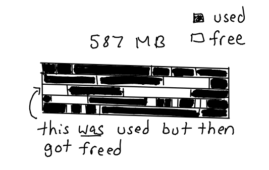
Here’s part of a diagram I made to illustrate memory fragmentation:
and a slightly more involved diagram showing the structure of a UDP packet:
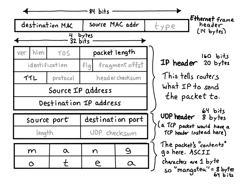
I love that I can use arrows / colours to emphasize things I think are important or give extra information. Like in this UDP packet diagram I greyed out fields that I thought were less important (like the “fragment offset”, which is definitely less important to understand than the source IP address).
make a joke
Computers are often really confusing and surprising. This can be kind of frustrating (“what is my program even doing?!!?!”) and also kind of funny! I think all the weird stuff that happens is part of the joy of computers! So sometimes I try to make jokes.
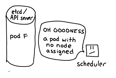
Here’s the Kubernetes scheduler all worried because it noticed a pod that it hasn’t been scheduled. (scheduler: “OH NO! I was supposed to have done that already! julia will be mad!”)
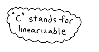
and a silly “C is for linearizable” joke (because the C in “CAP theorem” stand for “consistent”. But “consistent” is a pretty unclear term, so it’s more precise to say that it sounds for linearizable. So confusing!")
just write some text
I like using cartoons but sometimes I’ll just write a paragraph. Here’s the start of a page about dstat:

This basically just says “every second, dstat prints out how much network & disk your computer used that second”. I could have typed that! But I think writing it by hand emphasizes like “no, this is something I really love, I love it so much I wrote it out by hand and made a picture to show you!”
paste some computer output
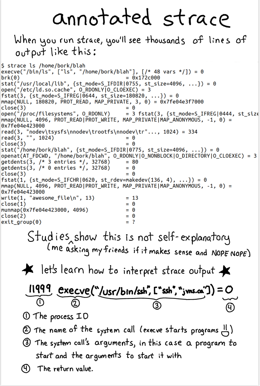
Sometimes I want to paste and discuss some output you might see on a computer. For example, when I made my strace zine I realized that a lot of strace output is really confusing. I wanted to paste some actual strace output to talk about!
Luckily that is really easy to do in a drawing, because you can just put anything you want in it!
trace icons/logos
At the beginning I said “I can’t draw well”, which is true! But I can trace things. It’s a fun way to make up for my lack of drawing skills.
It’s useful sometimes to include logos / icons! For example here are versions I traced of the Kubernetes logo, the Recurse Center logo, Tux (the linux penguin), and a cat. The cat isn’t anybody’s logo as far as I know.
The hand-traced versions of these logos are kind of wobbly and imprecise in a way that is pretty satisfying to me, I think they look cool.
designing your comics
You have a blank sheet of paper in front you, and some information you want to convey! How do you do it? Having a few structure patterns really helps. Here are some examples:
Here’s one way of making a list:
A list of many small things:

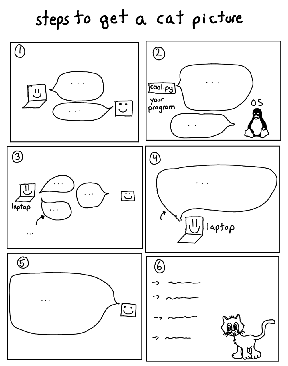
and yet another list, here a list of steps. This one is organized into numbered panels!
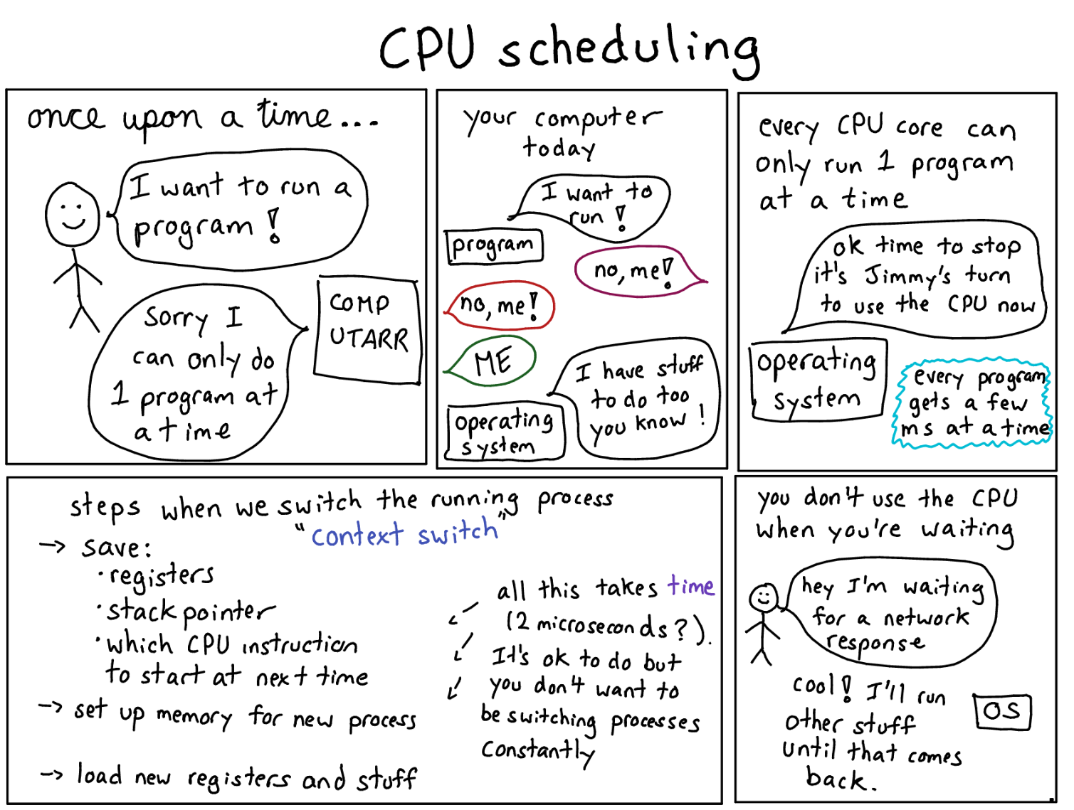
This one is more of a normal comic and less of a list – it’s visually laid out with squares/rectangles like a comic, and tells a bit of a story.
And finally this one is pretty unstructured. Personally I find this one a bit hard to to read/follow, I think having more structure than this is easier.
I think panels are a popular way of structuring comics for a reason, they help split up your drawing and make it clear what order the comic should be read in.
just making something a cartoon doesn’t necessarily mean it teaches what people need to know
I’m going to pick on another cartoon a bit here which I don’t really like to do but I need an example :).
There’s an extremely adorable guide to Kubernetes called The Children’s Illustrated Guide to Kubernetes.
I think this cartoon is cool and introduces a lot of important ideas. But for me personally I couldn’t understand how Kubernetes worked at all until I understood the role of etcd in Kubernetes (all the Kubernetes state is stored in etcd and every other Kubernetes component is stateless). And this cartoon doesn’t mention etcd even once! So I don’t think this cartoon would really have helped me understand Kubernetes.
I think there are kind of 2 ways to use drawings to teach:
- draw diagrams / cartoons that make what you’re teaching more clear
- use drawings to make what you’re teaching more fun
Making concepts more clear and more fun are both great goals! Making things fun can be a good way to make people pay attention and make hard concepts seem less intimidating!
But when I’m working on illustrations I find it useful to think about whether my drawings are actually helping explain the concept or whether they’re just fun (like drawing a picture of a shark when talking about Wireshark!).
In this children’s illustrated guide to kubernetes, I think the drawings mostly serve to make the content seem more fun – almost all the actual content is in the text. I think if you removed all the giraffe drawings the document would contain basically the same information! This is not a bad thing necessarily but I usually like to have more informational content in my drawings.
tools that make it easy
The tools I use today to make these are (see this interview for more)
- a Samsung Chromebook Plus (though any samsung tablet with an S-pen will work. Or an ipad with the apple pencil!)
- the Squid app for Android (goodnotes for ipad is good too!)
- that’s it!
Having a tablet I can draw on means I can really quickly draw something, click “share on Twitter” and immediately show it to the world. I definitely produce way more drawings with it than I did when I was working with pen and paper. And they look way better :)
drawings don’t have to be beautiful to be awesome
I started out by drawing things on paper with a pen / Sharpie and just taking pictures. They all looked way less good than everything I’ve posted above, but they were still really cool!!
For example here’s a very early drawing that I drew in pen on paper and posted to Twitter. Today I find this kind of janky & illegible but honestly when I posted it I got TONS of positive comments (evidence).
So drawings do not have to be beautiful and clean! They can be a sketchy thing you wrote on paper and that is okay.
how do you decide what’s a good subject for a tech cartoon?
Let’s take this comic on floating point I made last year! For that one, the steps were:
- Remember that I was really confused about floating key point until I learned a few key insights
from Stefan Karpinksi. When I learned these things my mind was totally blown and it was so
exciting!!!
- a double is 64 bits. That means there are only 2^64 floating point numbers!!!
- The smallest double after 2^52 is 2^52 + 1 (so 2^52 + 0.2 = 2^52).
- This means you can’t have integers above 2^53 in Javascript
- Think “well, those three things are really simple, I could put them in a comic”
- Figure out how to organize them into panels of a comic!!
- Don’t draw more than one page.
Here’s the final floating point comic I came up with in this example
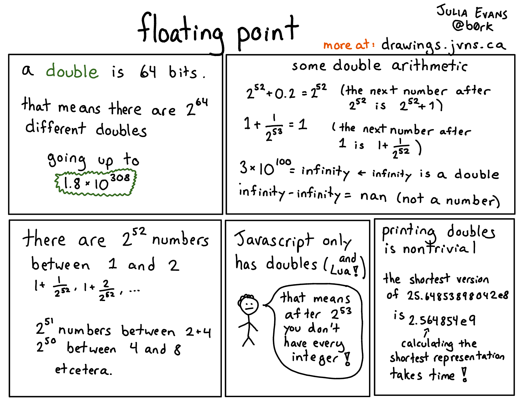
I organize a lot of my comics about some key insight / fact / surprising thing that it took me a long time to learn and was really useful to me.
Another example of this is this “how Unix permissions work” comic – like if you don’t know that
‘0644’ is a number in octal and why it maps to rw-r--r--, it’s hard to understand how permissions
work. Here’s the comic about unix permissions.
you could make tech illustrations too
If you are interested in drawing tech cartoons, I hope this blog post gives you some ideas about how to do that! I’ve seen a lot of people making great illustrations about tech:
If you’re interested in making cartoons I’d really recommend the book Understanding Comics, by Scott McCloud, it’s a really incredible explanation of how comics work. I learned a ton from reading it.
A few other people who are doing great work in tech comics:
- Lin Clark https://code-cartoons.com/ (a lot of React cartoons). She also has some awesome posts about Firefox internals like Inside a super fast CSS engine: Quantum CSS (aka Stylo)
- Amy Wibowo https://bubblesort-zines.myshopify.com (computer science zines!). I previously wrote an extended fan post about how great I think her work is.
- Mariko Kosaka https://twitter.com/kosamari tweets cool drawings! like this one about HTML1.x vs 2.x
- Vaidehi Joshi has been making awesome CS comics at https://medium.com/basecs