Organizing this blog into categories
Today I organized the front page of this blog (jvns.ca) into CATEGORIES! Now it is actually possible to make some sense of what is on here!! There are 28 categories (computer networking! learning! “how things work”! career stuff! many more!) I am so excited about this.
How it works: Every post is in only 1 category. Obviously the categories aren’t “perfect” (there is a “how things work” category and a “kubernetes” category and a “networking” category, and so for a “how container networking works in kubernetes” I need to just pick one) but I think it’s really nice and I’m hoping that it’ll make the blog easier for folks to navigate.
If you’re interested in more of the story of how I’m thinking about this: I’ve been a little dissatisfied for a long time with how this blog is organized. Here’s where I started, in 2013, with a pretty classic blog layout (this is Octopress, which was a Jekyll Wordpress-lookalike theme that was cool back then and which served me very well for a long time):

problem with “show the 5 most recent posts”: you don’t know what the person’s writing is about!
This is a super common way to organize a blog: on the homepage of your blog, you display maybe the 5 most recent posts, and then maybe have a “previous” link.
The thing I find tricky about this (as a blog reader) is that
- it’s hard to hunt through their back catalog to find cool things they’ve written
- it’s SO HARD to get an overall sense for the body of a person’s work by reading 1 blog post at a time
next attempt: show every post in chronological order
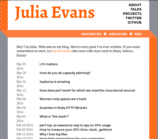
My next attempt at blog organization was to show every post on the homepage in chronological order. This was inspired by Dan Luu’s blog, which takes a super minimal approach. I switched to this (according to the internet archive) sometime in early 2016. Here’s what it looked like (with some CSS issues :))

The reason I like this “show every post in chronological order” approach more is that when I discover a new blog, I like to obsessively binge read through the whole thing to see all the cool stuff the person has written. Rachel by the bay also organizes her writing this way, and when I found her blog I was like OMG WOW THIS IS AMAZING I MUST READ ALL OF THIS NOW and being able to look through all the entries quickly and start reading ones that caught my eye was SO FUN.
Will Larson’s blog also has a “list of all posts” page which I find useful because it’s a good blog, and sometimes I want to refer back to something he wrote months ago and can’t remember what it was called, and being able to scan through all the titles makes it easier to do that.
I was pretty happy with this and that’s how it’s been for the last 3 years.
problem: a chronological list of 390 posts still kind of sucks
As of today, I have 390 posts here (360,000 words! that’s, like, 4 300-page books! eep!). This is objectively a lot of writing and I would like people new to the blog to be able to navigate it and actually have some idea what’s going on.
And this blog is not actually just a totally disorganized group of words! I have a lot of specific interests: I’ve written probably 30 posts about computer networking, 15ish on ML/statistics, 20ish career posts, etc. And when I write a new Kubernetes post or whatever, it’s usually at least sort of related to some ongoing train of thought I have about Kubernetes. And it’s totally obvious to me what other posts that post is related to, but obviously to a new person it’s not at all clear what the trains of thought are in this blog.
solution for now: assign every post 1 (just 1) category
My new plan is to assign every post a single category. I got this idea from Itamar Turner-Trauring’s site.
Here are the initial categories:
- Cool computer tools / features / ideas
- Computer networking
- How a computer thing works
- Kubernetes / containers
- Zines / comics
- On writing comics / zines
- Conferences
- Organizing conferences
- Businesses / marketing
- Statistics / machine learning / data analysis
- Year in review
- Infrastructure / operations engineering
- Career / work
- Working with others / communication
- Remote work
- Talks transcripts / podcasts
- On blogging / speaking
- On learning
- Rust
- Linux debugging / tracing tools
- Debugging stories
- Fan posts about awesome work by other people
- Inclusion
- rbspy
- Performance
- Open source
- Linux systems stuff
- Recurse Center (my daily posts during my RC batch)
I guess you can tell this is a systems-y blog because there are 8 different systems-y categories (kubernetes, infrastructure, linux debugging tools, rust, debugging stories, performance, and linux systems stuff, how a computer thing works) :).
But it was nice to see that I also have this huge career / work category! And that category is pretty meaningful to me, it includes a lot of things that I struggled with and were hard for me to learn. And I get to put all my machine learning posts together, which is an area I worked in for 3 years and am still super interested in and every so often learn a new thing about!
How I assign the categories: a big text file
I came up with a scheme for assigning the categories that I thought was really fun! I knew immediately that coming up with categories in advance would be impossible (how was I supposed to know that “fan posts about awesome work by other people” was a substantial category?)
So instead, I took kind of a Marie Kondo approach: I wrote a script to just dump all the titles of every blog post into a text file, and then I just used vim to organize them roughly into similar sections. Seeing everything in one place (a la marie kondo) really helped me see the patterns and figure out what some categories were.
Here’s the final result of that text file. I think having a lightweight way of organizing the posts all in one file made a huge difference and that it would have been impossible for me to seen the patterns otherwise.
How I implemented it: a hugo taxonomy
Once I had that big text file, I wrote a janky python script to assign the categories in that text file to the actual posts.
I use Hugo for this blog, and so I also needed to tell Hugo about the categories. This blog already technically
has tags (though they’re woefully underused, I didn’t want to delete them). I use Hugo, and it turns
out that in Hugo you can define arbitrary taxonomies. So I defined a new taxonomy for these sections
(right now it’s called, unimaginatively, juliasections).
The details of how I did this are pretty boring but here’s the hugo template that makes it display on the homepage. I used this Hugo documentation page on taxonomies a lot.
organizing my site is cool! reverse chronology maybe isn’t the best possible thing!
Amy Hoy has this interesting article called how the blog broke the web about how the rise of blog software made people adopt a site format that maybe didn’t serve what they were writing the best.
I don’t personally feel that mad about the blog / reverse chronology organization: I like blogging! I think it was nice for the first 6 years or whatever to be able to just write things that I think are cool without thinking about where they “fit”. It’s worked really well for me.
But today, 360,000 words in, I think it makes sense to add a little more structure :).
what it looks like now!
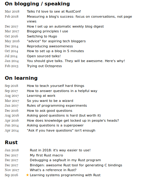
Here’s what the new front page organization looks like! These are the blogging / learning / rust sections! I think it’s cool how you can see the evolution of some of my thinking (I sure have written a lot of posts about asking questions :)).

I ❤ the personal website
This is also part of why I love having a personal website that I can organize any way I want: for both of my main sites (jvns.ca and now wizardzines.com) I have total control over how they appear! And I can evolve them over time at my own pace if I decide something a little different will work better for me. I’ve gone from a jekyll blog to octopress to a custom-designed octopress blog to Hugo and made a ton of little changes over time. It’s so nice.
I think it’s fun that these 3 screenshots are each 3 years apart – what I wanted in 2013 is not the same as 2016 is not the same as 2019! This is okay!
And I really love seeing how other people choose to organize their personal sites! Please keep making cool different personal sites.