Documentation site for rbspy!
Hello!! Latest update on my Ruby profiler: I published a documentation site!! It’s at https://rbspy.github.io.
I wanted to do a good job of this because my view about documentation is – if software isn’t well documented, it might as well not exist. I’ve spent SO MUCH time explaining other people’s software on this blog, so I figured it was extra important to make sure the software I write is well explained.
It has all the usual things: what is this software? How does it work? It also has a few extra things that I don’t always see on documentation sites though.
stackprof vs ruby
Extra thing 1: there’s a comparison (rbspy vs stackprof) between rbspy and stackprof, another Ruby profiler. This is not because rbspy is awesome and stackprof is bad (stackprof is very useful!), but because rbspy and stackprof are useful in different situations and so I wanted to explain when you should use each one!
guide to profiling in general
The other extra thing I included is a small guide to profiling. This is because I’ve heard from a lot of people who want to make their programs faster that they’re confused about some of the basics of profiling – what’s the difference between a benchmark and a profiler? What’s a flamegraph and how do I interpret it?
All of this documentation could actually apply to any profiling tool, not just rbspy. Here’s are the pages from the guide to profiling:
how I made the docs site
I wanted to have a really simple, pretty minimalist site. Nothing fancy! I did want it to feel like there was a little bit of care put into it, though. Here’s how I did it.
I used Hugo, which is my favorite static site generator. It’s what I use for this blog as well.
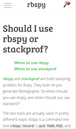
Next, I used the Crisp theme, which I found by searching for “minimalist” on the Hugo themes site. It’s already responsive, which was good – I wanted the site to work on mobile.
Then I manually edited the HTML/CSS in theme a bit to get what I wanted. The main change I made was to add a hamburger menu on mobile to make it (hopefully) easier to navigate. I used this example. My CSS skills aren’t great (I’ve only written HTML/CSS for tiny projects like this) so I was pretty proud of myself for getting the hamburger menu working :)
Here’s what the site looks like on mobile! Look, responsive! :D

Let me know if you have questions about rbspy!
If there are questions you have about using rbspy that this docs site doesn’t answer, please let me know!! I think documentation is really important, and if you have a question probably other people do too :). I’d love to add to the FAQ.
I’m julia@jvns.ca, or @b0rk on Twitter.